
Soundcloud
BACKGROUND
The SoundCloud app is one of the largest music and podcast streaming platforms in the world.
CHALLENGE
Although it is a popular app, some aspects of the interface and interaction are confusing.
TEAM AND MY ROLE
This project was a one-person team. I created the test plan and screener. I conducted an in-person pre-test interview and post-test questionnaire with 4 participants. I administrated an in-person usability test of 3 tasks as a moderator with 4 participants. Additionally, I performed a remote unmoderated usability test of 1 task with 3 participants.
TOOLS USED
Adobe Illustrator
Adobe InDesign
Android Mobile Devices
Google Docs
Google Drive
Google Sheets
UserTesting.com
SOLUTION
Before conducting the usability test, a usability test plan was created. It’s a document that details the objectives, participant criteria, logistics, methodology, and test script. The test plan is important because it contains all the information needed for the usability test and the questions and probes that the moderator will use to gather data about the user.
Objectives:
The current Home interface is bulky and overwhelming.
The thunderbolt icon used as the Stream icon is not intuitive and the users will not know what the thunderbolt represents.
The inconsistent organization Library interface is confusing and difficult to navigate.
Participants:
Participants were selected based on criteria from demographics and psychographic questions from the screener. Some of the criteria is a person who is between 18 - 45 years old and currently uses a streaming platform for music and podcasts.
7 participants were recruited and they are between the ages of 24 - 43 years old.
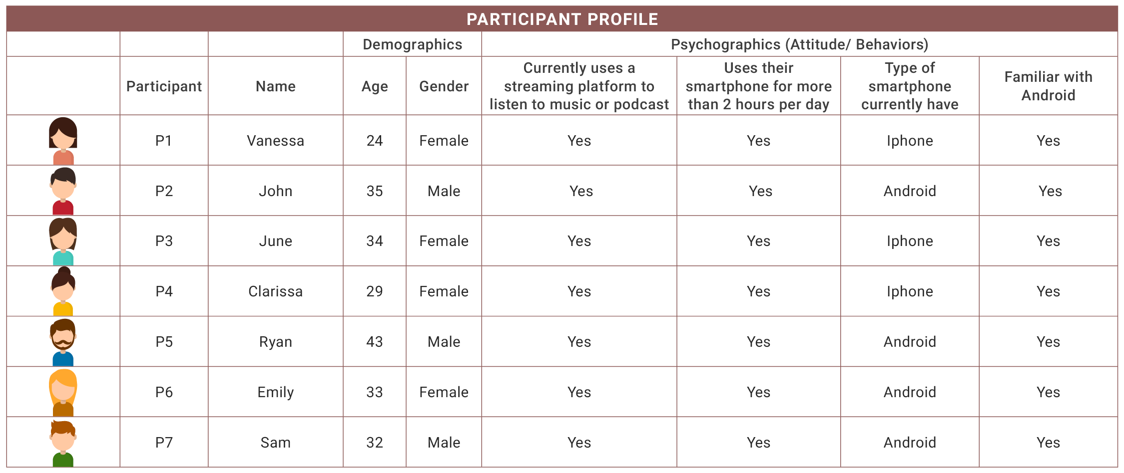
A visual overview of the participants create from data collected during usability sessions
In-person Moderated Testing Methodology:
A traditional usability study of in-person moderated testing was conducted with 4 participants using the SoundCloud app on an Android smartphone.
The tasks were counterbalanced to avoid any confounding variables. The order of the tasks was all different.
The naming convention of the tasks is in fruit names instead of numbers to allow the counterbalanced tasks to be undetected.
A brief 5-minute interview was conducted to build rapport between the moderator and participants.
Participants were asked to perform specific tasks using the SoundCloud app on an Android smartphone. The tasks were: to discover music you might like, locate the Stream section, and Locate the Recently Played section.
Participants were asked to use the Think-Aloud Protocol, where the participant vocalized their thoughts while performing specific tasks.
Participants were observed and notes of the participants’ quotes and behaviors were taken.
A post-test questionnaire was given to participants after completing the tasks.
Remote Unmoderated Testing Methodology:
Remote unmoderated testing via UserTesting.com was conducted with 3 participants using the SoundCloud app on an Andriod smartphone. The task was to create an account.
Participants were asked to perform a specific task unmoderated with their mobile screen and audio recorded.
Participants were probed after the task was done.
Participants were asked for their final thoughts.

A visual overview of whether the task was easy ot difficult for the participant
RESULTS
Task: Discover Music
Findings:
The Home navigation was moderately easy to navigate with the different scrolling options but there was a lot of scrolling.
The bulky Home interface did not live up to the user’s expectations of the content’s hierarchy and organization.

Current Home interface with full scroll
Recommendations:
It is recommended to shorten the scrolling by limiting the content displayed and changing the hierarchy and organization. Recently Played and Stream tabs should be added to the top followed by the Trending category and then the other categories.

Recommended Home interface solution
Task: Locate “Stream”
Findings:
All users think the thunderbolt icon doesn’t best represent Stream. They were all surprised, confused, and bothered by the icon.
All users didn’t expect the thunderbolt icon to be used to represent Stream. They thought the icon meant new music, popular music, hot jams, or top hits.

Current Stream interface with thunderbolt icon
Recommendations:
If SoundCloud would like to keep the thunderbolt icon, It is recommended to rename Stream to New Music.
If SoundCloud would like to keep the Stream section, it is recommended to replace the thunderbolt icon with a more intuitive icon such as a 3 squiggly lines icon.

Recommended solution option 1: New Music

Recommended solution option 2: Stream
Task: Locate “Recently Played”
Findings:
The users were not confused or bothered by the inconsistent organization of the Library interface or the different scrolling options.
All users were dissatisfied with the visual appearance of the Library interface.

Current Library interface
Recommendations:
It is recommended to improve the visual appearance by having only one header for Recently Played and Listening History, making all the thumbnail images square, and changing the icon for Liked Tracks, Playlists & Albums, Following, and Stations to orange.

Recommended Library interface solution with visual improvements
Task: Create Account
Findings:
All users found the task to be fairly easy and they said it was straightforward.
The route the users took to create an account was mostly due to convenience and whichever route they thought would be the quickest.
Most users were bothered that age and gender were asked when creating an account.

Current Create Account interface asking for age and gender
Recommendations:
It is recommended to add a Skip button as an option when age and gender are asked.

Recommended Create Account solution with Skip option